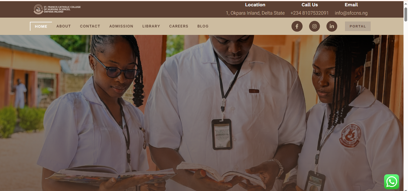
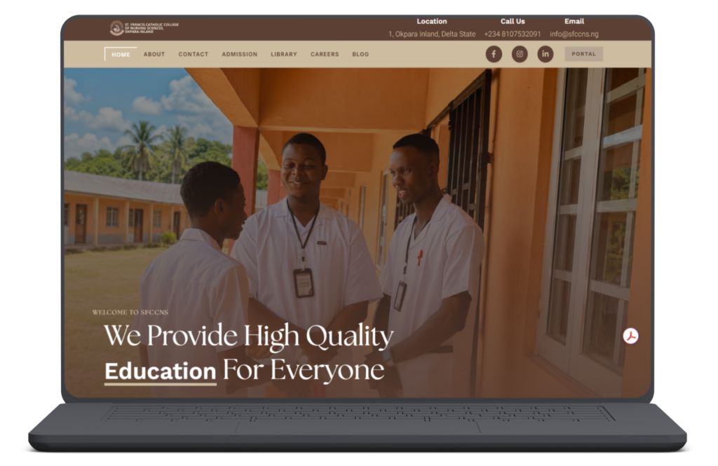
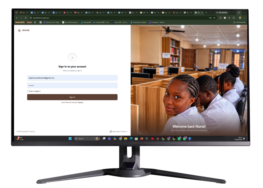
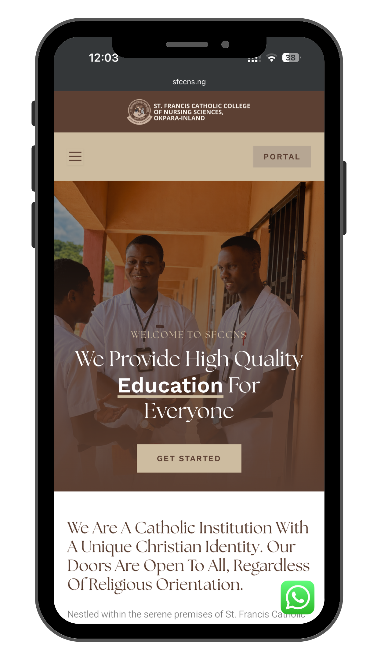
We treated the underlying information architecture, the admissions journey, the self-serve publishing setup, the portal/library integration pattern, as proven infrastructure worth reusing, while building an entirely distinct visual identity, page layout rhythm, and content voice specific to St. Francis. The goal was that a visitor who happened to see both sites would never suspect they came from the same studio.
We also used this second build to refine a few things we’d learned from Sancta Maria: the admissions flow was tightened further based on which questions kept coming up, and the staff-editing interface was simplified even more after watching how a non-technical user actually interacted with the first version.