GOENT NG runs three service lines under one brand, computer sales, online printing, and ICT solutions, so the identity needed to feel broad enough to cover all three without feeling generic
The Challenge
A brand built around just one of GOENT’s services (say, printing) would undersell the rest of the business. The identity needed to read as a capable, multi-service ICT company from the first glance.
Our Approach
We designed a versatile mark and colour system general enough to sit comfortably across hardware, print, and services marketing, while still feeling like one coherent company rather than three unrelated offerings loosely grouped together.
— VISUAL IDENTITY —
Colour Palette
Charcoal Blue
#334155
Deep blue
#DA3F3F
Cobalt blue
#045CB4
Ghost white
#F0F5FA
Off-black
#111111
— VISUAL IDENTITY —
Typography System
Display — Headlines & Logo
Radiance Redefined
Body — Product Copy & UI
Clean, confident skincare formulated for every skin tone, built around ingredients you can actually pronounce.
— VISUAL IDENTITY —
Logo in Context
Brand logo on off-black
Brand logo on Neutral gray
Brand logo on white
Brand logo on cobalt blue
— What We Delivered —
Brand Deliverables
Logo and Brand Mark
A versatile mark built to represent hardware, print, and services equally, not favouring one line of business.
Multi-Context Colour Palette
Suited to hardware, print, and services contexts, while still reading as one coherent company.
Brand Guidelines
A reference document covering consistent use across all three service lines.
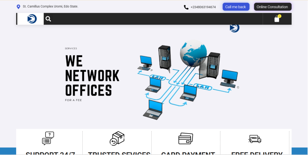
Multi-Service Website Application
The identity applied consistently across the multi-service website build that followed.
— A CLOSER LOOK —
Brand in Application
“Customers trust us with expensive devices, and our brand needed to reflect that. Twenty97 gave us an identity that looks legit, online and in the shop.”
— CEO, GOENT NG
—— SERVICES USED ON THIS PROJECT
Branding and graphice design
UI/UX design
Website development
NEXT PROJECT
Nurses Pen - Brand Identity for an Academic Research Platform