UI/UX Design

Education

nigeria

Designing an Interface Parents and Students Actually Enjoy Using

CLIENT

Sancta Maria College

Industry

Education

Service

Branding · Web Dev · UI/UX

Timeline

3 weeks

OVERVIEW

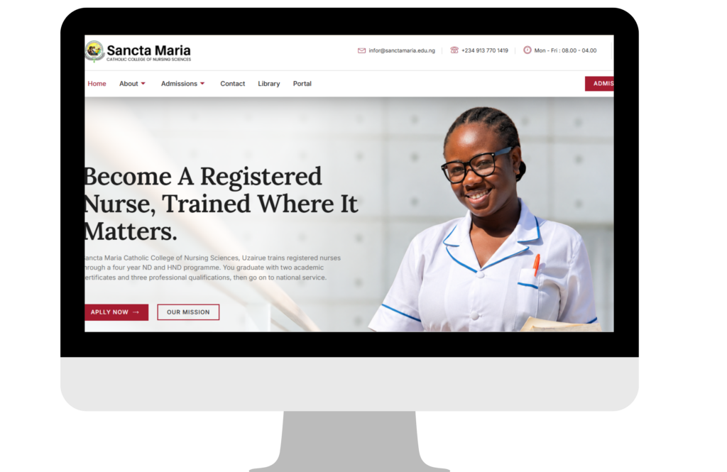
Sancta Maria’s site serves two very different visitors at once: prospective parents researching a college for their daughter, and current students who just need to find their portal or library link fast. The interface had to work for both without either one feeling like an afterthought.

The Challenge

A parent visiting for the first time and a returning student have almost opposite needs, one wants reassurance and information, the other wants speed and a direct link to a tool they already use. Designing one homepage for both risked serving neither well.

Our Approach

We separated the two journeys clearly from the homepage down: an admissions-focused path for prospective families, and a fast, low-friction route straight to the student portal and library for returning users, so neither audience has to wade through content meant for the other.

— What We Designed —

Key Interface Decisions

Dual-Audience Homepage

Clear separation between admissions content for prospective families and quick-access tools for current students.

One-Tap Portal & Library Access

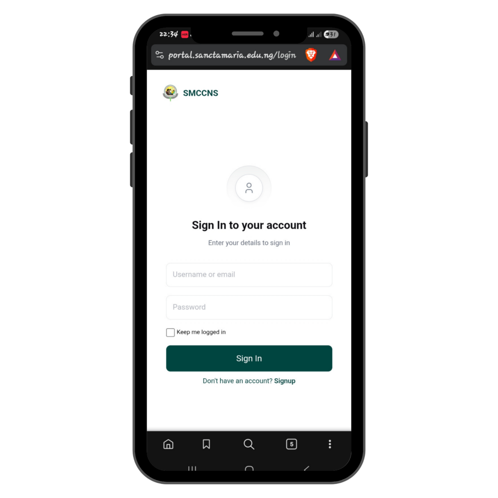
Returning students reach the portal or library in a single tap from the homepage, no digging through menus.

Mobile-First Layout

Designed assuming most visitors, parents and students alike, are on a phone, not a desktop.

— DESIGN PROCESS —

Returning Student Flow

Land on Homepage

Student arrives, no need to scroll past admissions content.

See Quick Links

Portal and library access shown clearly above the fold.

One Tap to Portal

Direct link, no digging through admissions-focused menus.

— SCREENS —

Mobile & Desktop

— design system —

Reusable Components

Buttons

Apply Now
Student Portal
Library Access

Programme Card

Nursing Science

Admissions Open

— BEFORE & AFTER —

What the Redesign Fixed

BEFORE
  • Portal and library links buried in menus
  • One homepage serving two very different needs
  • No clear priority between admissions and student content
AFTER
  • Portal and library one tap away from the homepage
  • Distinct paths for prospective families vs. students
  • Each audience sees what’s relevant to them first

2

Distinct audience paths from the homepage

1

Tap to reach the student portal

100%

Mobile-first layout

0

Confusion between admissions and student content

“Parents tell us the site is easy to navigate, and our students stopped asking us where the portal link is. That’s exactly what we needed.”

— Sancta Maria College

— SERVICES USED ON THIS PROJECT —

WEBSITE DEVELOPMENT

UI/UX design

Branding and graphic design

NEXT PROJECT

St. Francis College - Everyday Interfaces, Designed for Non-Technical Staff

—— HAVE A SIMILAR PROJECT IN MIND?

Let's design something your users actually enjoy.

Scroll to Top